
What if a single paint choice could completely transform the way your home feels? That’s the power of color. Choosing the right color combinations for home decor is one of the most impactful decisions you’ll make as a homeowner. And yet, most people treat it as an afterthought. The truth is, color sets the emotional tone of every room. Pairing it with the right color palette ideas gives you a cohesive, designer-level result without hiring a professional.
Whether you’re decorating a compact city apartment or a spacious suburban home, color is your most affordable design tool. It can make a small room feel airy or give a large space a cozy, intimate vibe. This guide walks you through everything you need to know about using color strategically and confidently.
Key Design Elements and Materials
Great home decor starts with understanding what you’re working with. Color doesn’t exist in isolation. It interacts with textures, furniture finishes, wall materials, and lighting. When these elements align, the result feels intentional and polished.
Here are the core elements to consider when planning your color approach:
- Wall finishes: Matte paint absorbs light and creates depth. Satin and eggshell finishes reflect light slightly, making colors feel brighter and cleaner.
- Furniture tones: Wood tones, upholstery colors, and metal finishes all interact with your wall colors. Warm wood pairs beautifully with earthy neutrals and terracotta shades.
- Textiles and rugs: These are the easiest way to introduce accent colors. Throw pillows, curtains, and area rugs let you test a color palette ideas without committing to paint.
- Natural materials: Linen, cotton, jute, and stone all carry subtle undertones. A linen sofa in warm ivory will shift how a sage green wall reads in a room.
If you’re on a tighter budget, focus on paint and soft furnishings first. These offer the highest visual impact for the lowest cost. You can always layer in furniture and decor pieces over time.
For larger homes, consider using a consistent base color across main living areas. Then introduce variation through accent walls or room-specific tones. This creates flow without making every room feel identical.
Color Palette and Lighting Strategy
Color and light are inseparable. A shade that looks perfect in the store can appear completely different once it’s on your wall at home. That’s because lighting changes how pigments appear throughout the day.
Natural light is the most flattering and honest source. North-facing rooms receive cooler, diffused light. This makes cool tones like blues and grays look crisp and calm. South-facing rooms get warmer, brighter light, which brings out the richness in warm tones like mustard, rust, and olive.
Artificial lighting matters just as much in the evenings. Warm white bulbs (around 2700K to 3000K) enhance earthy and warm color palettes. Cool white bulbs (around 4000K) work better with modern, minimalist, or monochromatic schemes. Always test your paint samples under both natural and artificial light before committing.
For apartments with limited natural light, go with light and warm neutrals. Creamy whites, soft blush, and pale sage can all make a small space feel more open. Avoid very dark colors on all four walls unless you’re going for a bold, moody effect intentionally.
In houses with open floor plans, use a consistent undertone across your color combinations for home decor to create visual harmony from room to room. For example, all warm-toned colors share yellow or red undertones. All cool-toned colors share blue or green undertones. Mixing undertones creates visual tension, which can feel unsettling.
Step by Step Interior Design Tips

Ready to start decorating? Follow these practical steps to apply color combinations for home decor with confidence. This process works whether you’re refreshing one room or redesigning your entire home.
Step 1: Choose your dominant color. This is the color that covers the most surface area, usually the walls. It sets the mood for the whole room. Start with one color you genuinely love.
Step 2: Pick a secondary color. This appears in large furniture pieces, a sofa, a bed frame, or a major rug. It should complement the dominant color without competing with it.
Step 3: Select one or two accent colors. These show up in smaller doses, think throw pillows, artwork, vases, or a single accent wall. Accents add energy and personality.
Step 4: Apply the 60-30-10 rule. Use your dominant color for 60 percent of the room, your secondary color for 30 percent, and your accent color for just 10 percent. This formula keeps the room balanced and visually calm.
Step 5: Test before you commit. Paint large swatches on the wall and live with them for 48 hours. Look at them in morning light, afternoon sun, and evening lamp light. Trust what you see at home, not in the store.
Using a curated color palette ideas resource can also help you find proven pairings that work well together. This saves time and removes the guesswork from the process.
Style Variations and Decor Ideas
Not every home fits the same style. The beauty of working with color is that you can adapt it to almost any aesthetic. Here’s how different design styles use color:
Modern and minimalist: Stick to a tight palette of two to three colors. White, charcoal, and one warm accent like camel or warm wood tones work beautifully. Keep it clean and uncluttered.
Scandinavian: Soft whites, pale grays, and muted dusty blues create that calm, cozy Nordic feel. Add natural wood textures to warm up the space. Think simple, functional, and serene.
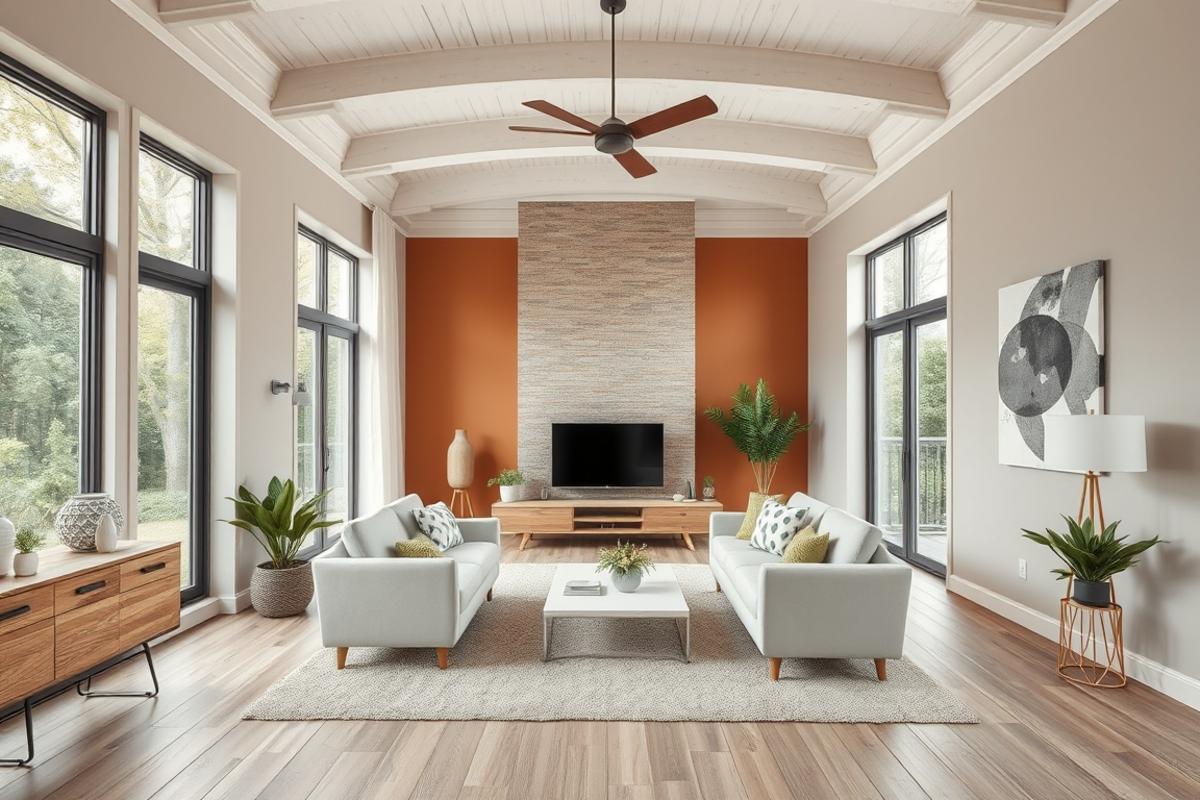
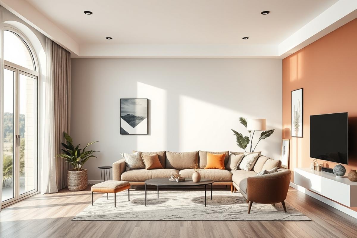
Boho and eclectic: This style welcomes bolder color combinations for home decor. Rich terracotta, deep teal, warm mustard, and burnt orange can all coexist. The key is balancing warm and cool tones so the room doesn’t feel chaotic.
Luxury and maximalist: Deep jewel tones like emerald green, sapphire blue, and plum pair with gold and brass accents. Layer textures like velvet, marble, and lacquered wood to amplify the richness of the color palette.
Cozy farmhouse: Warm whites, sage greens, navy blues, and warm browns feel grounded and inviting. Pair with natural linen, shiplap textures, and wooden furniture for a relaxed American farmhouse look.
Common Decorating Mistakes to Avoid
Even experienced decorators make color mistakes. Knowing what to avoid saves you time, money, and a lot of repainting. Here are the most common pitfalls and how to fix them.
Matching everything too perfectly. A room where every single element matches looks staged, not lived in. Instead, aim for harmony with a few intentional contrasts. Mix wood tones. Let your accent color surprise you slightly.
Ignoring undertones. You might pick two “neutral” colors that clash because one has a pink undertone and the other has a yellow one. Always compare undertones side by side before purchasing.
Choosing color based only on swatches. Small paint swatches are misleading. Colors appear much more intense on a large wall. Always test with a large sample area before committing to a full room.
Forgetting the ceiling and trim. These are part of your color palette ideas too. White trim with a warm wall color needs a warm-toned white, not a stark cool white. The ceiling color also affects how tall or intimate a room feels.
Using too many accent colors at once. More than three accent colors in a single room creates visual chaos. Pick one or two, and repeat them throughout the space to create cohesion.
Maintenance and Long Term Style Tips
A well-designed color scheme should stand the test of time. But interiors do need occasional refreshing. Here’s how to keep your home looking intentional and well-maintained year after year.
Touch up your painted walls every one to two years in high-traffic areas. Kitchens, hallways, and kids’ rooms take the most wear. Keep a small amount of leftover paint stored in a sealed container for easy spot repairs.
Swap out soft furnishings seasonally. In fall and winter, introduce deeper, warmer tones through throw blankets and pillows. In spring and summer, bring in lighter linens and fresher greens or soft florals. This keeps your decor feeling current without repainting.
Reassess your color combinations for home decor every few years. Trends shift, and so do your personal tastes. You don’t need a full renovation. Sometimes repainting one wall or swapping a rug completely refreshes a space.
For budget-friendly updates, focus on artwork and decorative objects. A new piece of wall art in a fresh color introduces a new tone without touching your walls. It’s a low-commitment way to experiment with new color palette directions.
Conclusion
Color is the soul of a well-designed home. When you understand how to use color combinations for home decor thoughtfully, every room can feel more intentional, more beautiful, and more you. Start with a palette that reflects your lifestyle and build from there. And remember, the right color palette ideas don’t have to be complicated. Simple, cohesive, and personal always wins over trendy and overdone.
Whether you’re just starting your first apartment or refreshing a longtime family home, these tips give you a clear, practical foundation. Take it one room at a time. Enjoy the process. And explore more inspiration right here on ItsDecor.com for your next design project.
FAQs
What are the best color combinations for a small living room?
Light and airy combinations work best in small spaces. Try soft white walls with warm wood tones and a muted sage or blush accent. These combinations reflect light and make the room feel larger. Avoid using more than three colors in a small living room.
How do I choose a color palette for an open floor plan?
Use a consistent base or undertone across all connected spaces. You can shift the intensity or use complementary shades from room to room. The key is making sure the colors flow naturally when viewed together from different angles.
Can I mix warm and cool colors in the same room?
Yes, but do it intentionally. Use one temperature as the dominant tone and the other as an accent. For example, a warm terracotta wall can pair with cool blue-gray throw pillows. The contrast creates visual interest without feeling jarring.
How many colors should I use in one room?
Most professional designers recommend a maximum of three to four colors per room. Follow the 60-30-10 rule: 60 percent dominant, 30 percent secondary, and 10 percent accent. This keeps the space balanced and cohesive.
How often should I update my home’s color scheme?
There’s no strict rule, but a light refresh every three to five years keeps your home feeling current. You don’t need to repaint every room. Start with soft furnishings like pillows, rugs, and curtains. These small changes can shift the entire feel of a color scheme without major cost or effort.