
Warm Neutral Color Palette Home: The Ultimate Guide to Timeless, Cozy Interiors
Your home should feel like a deep breath. Calm, warm, and completely yours. If you’ve been searching for a design style that never goes out of fashion, a warm neutral color palette home is exactly where you should start. These tones create spaces that feel grounded and inviting without trying too hard. And when you pair the right colors with the right warm neutral home decor, the result is a living space that feels both effortless and beautifully put together.
Whether you live in a spacious house in the suburbs or a compact city apartment, warm neutrals work everywhere. They’re flexible, forgiving, and endlessly stylish.
Key Design Elements and Materials
The foundation of any warm neutral color palette home starts with the right materials. Think natural textures, organic shapes, and finishes that feel handcrafted rather than mass-produced.
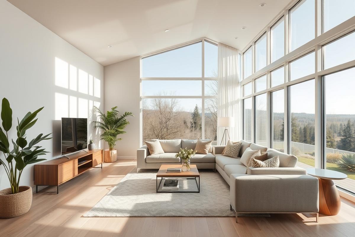
Colors: Start with a base of soft whites, creamy ivory, warm beige, sandy tan, or greige (a beautiful blend of gray and beige). These tones set a relaxing tone throughout the home.
Textures: Layer in linen, jute, cotton, wool, and raw wood. These materials add visual depth without introducing loud colors. They keep things interesting without feeling chaotic.
Furniture: Look for pieces with rounded edges and natural wood legs. Upholstered sofas in oatmeal, camel, or terracotta work beautifully. Even on a budget, slipcovers in neutral tones can transform a tired sofa instantly.
Wall Finishes: Matte paint finishes absorb light softly and feel more organic than glossy walls. Limewash paint is a stunning option for living rooms and bedrooms. It adds texture and depth with a single color.
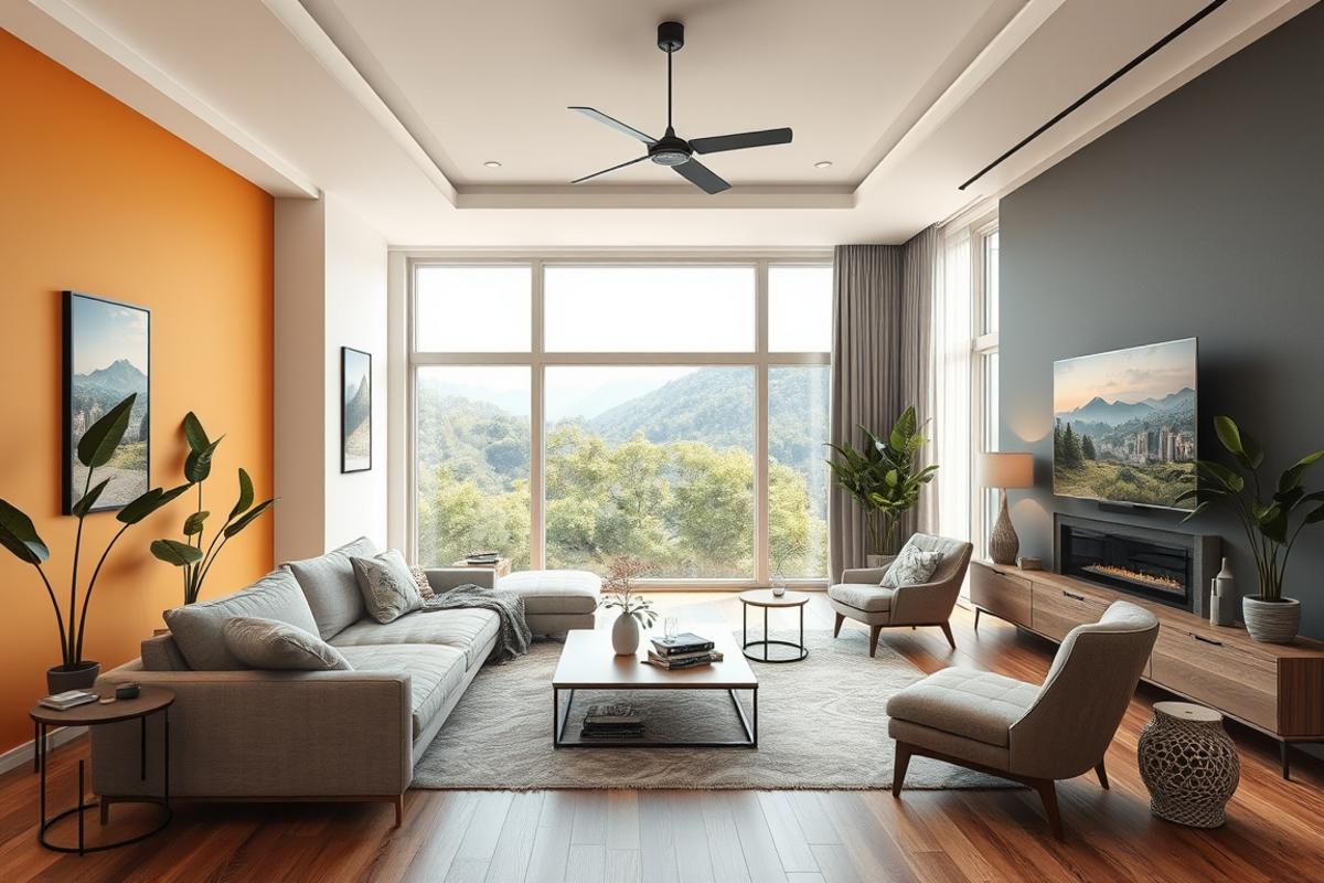
Accents: Warm metals like brass, bronze, and gold add warmth without overwhelming the palette. Darker tones like rich chocolate brown or deep rust work well as grounding accent colors.
Color Palette and Lighting Strategy
Color and light are inseparable. The way light hits a warm neutral wall can completely change how the color reads in your space.
In rooms with plenty of natural light, cool-leaning neutrals like greige or soft linen white will look fresh and airy. In darker rooms or north-facing spaces, lean toward warmer tones like honey beige or creamy off-white to counteract the cool light.
Natural lighting tips:
– Keep window treatments sheer and light-filtering
– Use mirrors to bounce daylight deeper into the room
– Place furniture to avoid blocking light paths
Artificial lighting strategy: Avoid harsh white LED bulbs in a warm neutral space. Instead, choose warm white bulbs with a color temperature around 2700K to 3000K. This brings out the golden undertones in your walls and textiles beautifully.
For apartments without abundant natural light, layered lighting is your best friend. Use a combination of floor lamps, table lamps, and recessed lighting at different heights. This creates warmth and dimension even in a small studio.
In larger homes, consider dimmer switches throughout. The ability to control light intensity changes the entire mood of a room from morning to evening.
Step by Step Interior Design Tips

Ready to design your space? Follow these steps to build a cohesive and beautiful result.
Step 1: Choose your anchor color. Pick one base neutral for your walls. Keep it consistent across open-plan areas. This creates visual flow and makes spaces feel larger.
Step 2: Layer your textiles. Add throw pillows, blankets, and area rugs in varying textures but similar tones. A jute rug under a linen sofa instantly adds warmth and dimension.
Step 3: Bring in wood tones. A coffee table, open shelving, or wooden picture frames introduce natural warmth. Mix light and medium wood tones for an organic, collected look.
Step 4: Add greenery. Live plants bring life and contrast to a warm neutral color palette home. A fiddle-leaf fig, a trailing pothos, or a cluster of small succulents all work wonderfully.
Step 5: Edit your decor. Less is always more in this style. Choose intentional pieces over lots of small trinkets. Group objects in odd numbers for a designer-approved look.
Step 6: Source the right accessories. Shop for quality warm neutral home decor items like ceramic vases, woven baskets, and linen cushion covers. These small details make a big impact on the overall feel.
Room layout tip: Always anchor your seating around a focal point. That could be a fireplace, a large window, or a statement piece of art. Keep a clear flow path through the room. Aim for at least 30 to 36 inches of walkway between furniture pieces.
Style Variations and Decor Ideas
The beauty of warm neutrals is that they adapt to almost any design style. Here are a few popular directions you can take.
Modern Warm Neutral: Keep lines clean and furniture low-profile. Add warmth through materials rather than ornament. Think smooth concrete, raw oak, and matte ceramics.
Cozy Farmhouse: Layer chunky knit throws, shiplap walls, and vintage wood accents. This version feels lived-in and deeply comfortable.
Scandinavian Inspired: Lean into minimalism with a white-and-birch base. Add soft terracotta or dusty clay as accent tones. Keep surfaces clear and clutter-free.
Luxury Neutral: Introduce velvet cushions, marble side tables, and silk-look drapes. A warm neutral palette can absolutely feel elevated and high-end with the right finishes.
Boho Warm Neutral: Layer patterned textiles with global-inspired textures. Mix macrame, rattan, and earthy ceramics for a relaxed but curated feel.
No matter your style direction, the warm neutral base keeps everything feeling cohesive and serene.
Common Decorating Mistakes to Avoid
Even the most beautiful palette can fall flat if you make a few common missteps. Here’s what to watch out for.
Mistake 1: Choosing the wrong white. Not all whites are warm. Some read blue or green under certain lighting. Always test paint samples on your actual wall before committing.
Mistake 2: Forgetting contrast. A room that’s all the same tone looks flat and lifeless. Add contrast through darker accents, wood tones, or one deeper color on a feature wall.
Mistake 3: Ignoring scale. Oversized furniture in a small room feels cramped. Undersized pieces in a large room look lost. Always measure your space before buying.
Mistake 4: Skipping texture. Warm neutrals need texture to feel interesting. If everything is smooth, the room will look cold and empty. Layer at least three different textures in every room.
Mistake 5: Over-accessorizing. Adding too many decorative items kills the calm that warm neutrals create. Edit ruthlessly. If a piece doesn’t contribute, remove it.
Professional tip: Take a photo of your room and look at it on your phone screen. This gives you a fresh perspective and helps you spot what’s off.
Maintenance and Long Term Style Tips
One of the biggest advantages of a warm neutral color palette home is how easy it is to maintain and refresh over time.
Cleaning tips: Linen and cotton upholstery should be spot-cleaned regularly. Use a soft brush attachment on your vacuum to refresh cushions and sofas weekly. Natural fiber rugs like jute or sisal can be shaken out or lightly vacuumed.
Seasonal refreshes: In fall and winter, add deeper tones through throw blankets and candles. Think amber, cinnamon, and deep cream. In spring and summer, swap to lighter linen and introduce fresh greenery.
Budget-friendly updates: You don’t need to redecorate completely each season. Simply swap out throw pillows, change your table centerpiece, and rotate your wall art. Small changes make a big difference.
Long-term style advice: Invest in quality where it counts. A well-made sofa or a solid wood dining table will look better with age. Save on accent pieces and decorative accessories where trends change quickly.
Keep your palette consistent even as you update. That consistency is what gives warm neutral home decor its timeless quality.
Conclusion
Creating a beautiful home doesn’t require bold colors, expensive renovations, or a complete redesign. Sometimes the most powerful design move is choosing warmth, softness, and simplicity. A warm neutral color palette home delivers exactly that. It gives you a backdrop that feels calm, flexible, and deeply livable.
By pairing the right textures, lighting, and furniture with thoughtfully chosen warm neutral home decor, you can transform any space into something that feels both intentional and effortlessly beautiful.
Start small if you need to. Paint one wall. Add a new rug. Swap your throw pillows. Every small step moves you closer to the home you’ve been envisioning.
Explore more design inspiration and practical styling guides right here on ItsDecor.com. Your dream home is closer than you think.
FAQs
What is a warm neutral color palette for a home?
A warm neutral color palette includes colors like beige, cream, ivory, sand, greige, taupe, and warm white. These tones have yellow, red, or orange undertones. They create a cozy, welcoming atmosphere in any room.
How do I add warmth to a neutral room without using color?
You can add warmth through texture and materials. Try layering linen, wool, jute, and raw wood. Warm-toned lighting also makes a significant difference. Brass or bronze hardware adds warmth without introducing a new color.
Can warm neutral tones work in a small apartment?
Absolutely. Warm neutrals are actually ideal for small spaces. They make rooms feel larger and more open than dark or busy colors. Stick to lighter tones on walls and use texture to add interest without visual clutter.
What accent colors work best with a warm neutral palette?
Great accent choices include terracotta, dusty rose, sage green, rust, deep brown, and muted gold. These tones feel harmonious with a warm neutral base. They add personality without disrupting the overall calm of the space.
How often should I refresh my warm neutral decor?
A simple seasonal refresh twice a year is usually enough. Swap textiles and accessories in fall and spring. For bigger updates, consider repainting an accent wall or introducing a new piece of furniture every few years. Consistency in your base palette makes refreshes much easier and more affordable.